
Picture a small bakery that only has enough flour and oven space to make bread or cake on any given day, never an unlimited amount of both. Every extra loaf of bread it decides to bake means a little less cake comes out of the oven. That tradeoff, in a nutshell, is what economists spend entire courses trying to explain, and a simple two-line graph captures it better than paragraphs of text ever could.
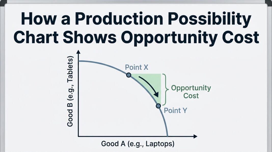
So how does a production possibility chart assist in outlining opportunity cost? It does it visually, by plotting every possible combination of two goods a person, business, or economy could produce with limited resources, then letting the shape and slope of that line show exactly what gets sacrificed each time more of one good is chosen over the other. Once you see it drawn out, the whole idea of tradeoffs stops feeling abstract and starts looking like basic arithmetic.
This piece walks through exactly how that graph works, why its curve bends the way it does, and how to read opportunity cost directly off the line without needing an economics degree to follow along.
What a Production Possibility Chart Actually Shows
A production possibility chart, sometimes called a production possibilities frontier or production possibilities curve, plots the maximum combinations of two goods that can be produced using a fixed set of resources. Every point sitting on the line represents an efficient use of those resources, meaning nothing is being wasted or left idle.
Points that fall inside the curve represent inefficient production, where resources are sitting unused or being misallocated. Points outside the curve represent combinations that simply aren’t possible right now, given current technology and resource limits.
The graph only ever compares two goods at a time, which keeps it simple enough to draw on a napkin while still capturing a very real economic principle. Whether you’re looking at a country choosing between healthcare spending and education spending, or a farmer choosing between planting corn and soybeans, the same basic shape applies.
Why Opportunity Cost Sits at the Center of the Graph
Opportunity cost is simply the value of the next best alternative you give up when you make a choice. It isn’t limited to money. Time, resources, and effort all carry opportunity costs too.
On a production possibility chart, opportunity cost shows up as the amount of one good you must give up to produce more of the other. If a farmer shifts land from soybeans to corn, the opportunity cost of that extra corn is measured in the bushels of soybeans no longer grown.
This is exactly what the slope of the production possibilities frontier represents, since moving along the curve from one point to another shows precisely how much of one good is traded away for more of the other. Reading that slope is really all it takes to calculate opportunity cost directly from the graph, without needing a separate formula.
Reading the Curve: A Simple Two-Good Example
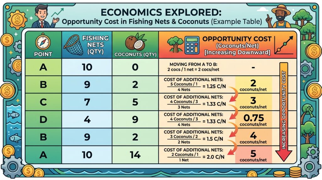
Numbers make this much easier to follow than theory alone, so here’s a simplified example using a small island economy that only produces two things: fishing nets and coconuts.
| Combination | Fishing Nets | Coconuts | Opportunity Cost of Next Net |
|---|---|---|---|
| A | 0 | 100 | — |
| B | 2 | 90 | 5 coconuts per net |
| C | 4 | 70 | 10 coconuts per net |
| D | 6 | 40 | 15 coconuts per net |
| E | 8 | 0 | 20 coconuts per net |
Notice something important here. The opportunity cost of each additional net doesn’t stay the same as production shifts. It climbs steadily from 5 coconuts to 20 coconuts per net. That pattern isn’t a coincidence, and it’s exactly what gives the curve its distinctive bowed shape rather than a straight line.
Why the Curve Bends: The Law of Increasing Opportunity Cost
If resources were perfectly interchangeable between two goods, the chart would be a straight line and opportunity cost would stay constant no matter what combination you produced. In reality, that’s rarely how production works.
Resources tend to be better suited to producing certain goods than others. A skilled fisherman isn’t necessarily efficient at climbing coconut trees, and farmland suited for soybeans isn’t always ideal for corn. As production shifts further toward one good, resources that are progressively less suited to that task get pulled in, which pushes up the cost of each additional unit.
This pattern is common enough that economists have a name for it. The law of increasing opportunity cost holds that as production of a good increases, the additional opportunity cost of producing more of it rises as well. That’s the entire reason the curve bows outward instead of running in a straight diagonal line.
Constant vs. Increasing Opportunity Cost
Not every production possibility chart bows outward. The shape depends entirely on how easily resources shift between the two goods being produced.
- Straight-line charts appear when resources are equally well suited to producing either good, which makes opportunity cost the same no matter where along the line production sits. This is uncommon in the real world but useful as a simplified teaching model.
- Bowed, concave charts appear when resources aren’t equally suited to both goods, which is the far more common and realistic scenario, and is why most textbook examples use this curved shape.
Recognizing which shape you’re looking at tells you immediately whether opportunity cost is fixed or rising as production shifts, which is often the exact question being tested in an introductory economics course.
Efficiency, Growth, and Scarcity on the Same Graph
Opportunity cost isn’t the only concept this chart illustrates, though it’s the one most beginners focus on first. A few related ideas show up on the exact same graph.
- Scarcity is represented by the curve itself, since it marks the outer limit of what’s possible with current resources.
- Efficiency is shown by whether a chosen combination sits directly on the curve or falls short of it inside the boundary.
- Economic growth is represented by the entire curve shifting outward, which happens when new resources, technology, or workers become available and expand what’s possible to produce.
- Trade-offs are shown by movement along the curve itself, which is where opportunity cost comes into play.
Seeing all four ideas on a single graph is part of why this tool shows up so often in early economics coursework. It’s a compact way to teach several foundational concepts at once rather than covering each one separately.
Efficient, Inefficient, and Unattainable Points Explained
Every point on a production possibility graph falls into one of three categories, and understanding the difference makes the whole chart much easier to interpret at a glance.
Points on the Curve
These represent full and efficient use of available resources. Nothing is being wasted, and any shift to produce more of one good automatically means producing less of the other.
Points Inside the Curve
These represent underutilized resources, whether that’s idle factories, unemployed workers, or unused farmland. A combination that falls inside the frontier is considered inefficient because resources are being underutilized rather than fully deployed.
Points Outside the Curve
These represent combinations that simply cannot be achieved with current resources and technology. Reaching a point outside the current curve requires the curve itself to shift outward first, typically through new technology, additional resources, or a larger workforce.
How This Differs From a Budget Constraint
Students often confuse a production possibility chart with a budget constraint graph, since both compare tradeoffs between two things using a downward-sloping line. The two aren’t the same tool, though.
A budget constraint is almost always a straight line, because it’s based on fixed prices for two goods. A production possibility chart, on the other hand, is usually curved, because the combinations available depend on how well resources transfer between the two goods being produced rather than on a fixed price ratio.
In short, a budget constraint answers “what can I afford,” while a production possibility chart answers “what can be produced.” Both use opportunity cost as their underlying logic, but they’re modeling different kinds of decisions.
How to Calculate Opportunity Cost From the Chart
Beyond just eyeballing the slope, there’s a straightforward way to actually calculate opportunity cost between any two points on the curve, and it works the same way whether you’re comparing coconuts and fishing nets or healthcare and education spending.
The formula is simple: divide the amount of the good given up by the amount of the good gained.
Opportunity Cost = Amount of Good Given Up ÷ Amount of Good Gained
Using the earlier fishing nets and coconuts table, moving from combination B to combination C means coconut production drops from 90 to 70, a loss of 20 coconuts, while net production rises from 2 to 4, a gain of 2 nets. Dividing 20 by 2 gives an opportunity cost of 10 coconuts per additional net, which matches exactly what the table already showed.
This same calculation works in reverse too. If you wanted to know the opportunity cost of gaining more coconuts instead, you’d simply flip the formula and divide the nets given up by the coconuts gained. Whichever direction you calculate, the number tells you precisely what’s being sacrificed for the other.
Marginal Opportunity Cost vs. Total Opportunity Cost
There’s an important distinction between the opportunity cost of a single additional unit and the total opportunity cost of a much larger shift in production, and mixing the two up is a common source of confusion.
Marginal opportunity cost refers to the cost of just the next unit produced, which is what most of the calculations and examples in this guide have focused on so far. It’s the number that changes as you move along a curved frontier.
Total opportunity cost refers to everything given up across an entire shift in production, from one combination all the way to another. If an economy moves from producing mostly coconuts to producing mostly fishing nets, the total opportunity cost is the full amount of coconuts sacrificed across that entire journey, not just the cost of the very last net produced.
Understanding this difference matters because a single “opportunity cost” number rarely tells the whole story on a curved frontier. The cost of the first few units produced is often much lower than the cost of the last few, which is exactly why the total sacrifice adds up faster than a quick glance at the graph might suggest.
Real-World Examples of Production Possibility Charts
Textbooks tend to use simplified two-good examples, but the same logic applies to real decisions made every day.
- A government choosing how to split a limited budget between healthcare funding and education funding
- A factory deciding how to allocate machine hours between two different products
- A farmer dividing acreage between two crops based on soil, season, and market demand
- A student splitting a fixed number of study hours between two subjects before final exams
In every case, more of one option always comes at the direct expense of the other, and the “curve” describing that relationship, even if never physically drawn, still governs the decision.
Why This Particular Chart Is So Widely Taught
Given how many tools economists have available, it’s worth asking why this particular two-line graph shows up in nearly every introductory course and textbook chapter on scarcity.
Part of the answer is accessibility. Unlike supply and demand curves, which require understanding market interactions between buyers and sellers, a production possibility chart only requires understanding a single decision-maker’s limited resources. That makes it an ideal starting point before layering on more complex market dynamics.
Another reason is versatility. The exact same two-line shape can represent a single household deciding how to split a weekend between chores and relaxation, a small business allocating machine time between two products, or an entire national economy choosing between military spending and consumer goods. Swapping out the labels on the axes is often the only change needed to apply the model to a completely different scenario.
Finally, the chart rewards a slow, careful reading rather than requiring memorized formulas upfront. Students can build intuition just by staring at the shape of the curve and asking simple questions: where does more of one good come from, and what has to give up space to make room for it. That hands-on, visual style of learning tends to stick better than abstract theory alone, which is likely why this remains one of the first graphs drawn in any economics classroom.
Common Mistakes When Reading These Charts
A few misunderstandings come up repeatedly among beginners working through this concept for the first time.
- Assuming the curve is always straight. Most real-world examples bow outward due to increasing opportunity cost, not constant cost.
- Confusing “inside the curve” with “impossible.” Points inside the curve are entirely possible, just inefficient, which is the opposite of points outside the curve.
- Forgetting that opportunity cost changes along the curve. The cost of the next unit isn’t fixed unless the graph is a straight line.
- Mixing up growth with movement along the curve. Producing more of one good by giving up another is movement along the existing curve. Producing more of both goods at once requires the entire curve to shift outward.
Pros and Cons of Using a Production Possibility Chart
Pros
- Simplifies a complex tradeoff into a single, easy-to-read visual
- Demonstrates several concepts at once, including scarcity, efficiency, and growth
- Works for comparing almost any two competing uses of limited resources
- Requires no advanced math to interpret at a basic level
Cons
- Limited to comparing exactly two goods or options at a time
- Real economies produce far more than two goods, so the model is a simplification
- Doesn’t account for changing prices, preferences, or external market shocks
- Can oversimplify complex resource allocation decisions in practice
Expert Tips for Understanding Opportunity Cost on This Graph
- Always read the slope, not just the shape. The steepness between any two points tells you the actual opportunity cost of that specific tradeoff.
- Check whether the curve is bowed or straight before assuming anything about cost. This single detail tells you whether opportunity cost is rising or constant.
- Separate movement along the curve from a shift of the curve. One represents a tradeoff decision, the other represents genuine economic growth.
- Use small, round numbers when practicing. Working through a simplified table, like the fishing nets and coconuts example above, builds intuition faster than jumping straight into abstract theory.
- Remember that “efficient” doesn’t mean “ideal.” Every point on the curve is efficient, but which point is best depends entirely on what a society or business actually values.
Frequently Asked Questions
What does a production possibility chart measure?
It measures the maximum combinations of two goods or services that can be produced using a fixed set of resources and existing technology. Every point along the curve represents a fully efficient use of those resources, while the shape of the curve itself reveals how opportunity cost behaves as production shifts from one good to the other. It’s one of the earliest tools introduced in economics coursework precisely because it packs so many foundational ideas into a single visual.
Why is opportunity cost usually increasing rather than constant?
Opportunity cost tends to rise because resources aren’t equally suited to producing every good. As more resources shift toward one product, the ones being reassigned are progressively less efficient at that task, which pushes up the cost of each additional unit. This is why most real-world production possibility charts curve outward instead of forming a straight line, and it’s also why the very last units of any good tend to be the most expensive to produce in terms of what’s sacrificed.
Can a production possibility chart show more than two goods?
Not directly. The two-dimensional graph is limited to comparing exactly two goods or categories at once, which is part of what makes it easy to read and teach. Economists studying more complex situations involving several goods typically rely on other models and mathematical tools, but the same underlying opportunity cost logic still applies no matter how many variables are involved.
What does it mean if a point falls inside the curve?
A point inside the curve represents an inefficient use of available resources, such as idle machinery, unused land, or unemployed workers. It’s still a possible outcome, just not one that makes full use of what’s available, unlike points sitting directly on the curve. Recognizing this distinction is often the first step toward understanding why economists care so much about efficiency in the first place.
How can the curve shift outward over time?
The curve shifts outward when the overall production capacity of an economy or business increases, typically through new technology, additional resources, a larger workforce, or improved efficiency methods. This kind of shift represents genuine economic growth, as opposed to simply trading one good for another along the existing curve. A curve shifting inward, on the other hand, would represent a loss of productive capacity, such as a natural disaster or a major resource shortage.
Final Thoughts
A production possibility chart turns an abstract idea, the tradeoffs baked into every economic decision, into something you can literally see and measure. The curve’s shape tells you whether costs rise or stay flat, the slope tells you exactly what’s being sacrificed at any given point, and the space inside versus outside the line tells you whether resources are being used well at all.
Once that clicks, opportunity cost stops being a vocabulary term to memorize and starts being a lens you can apply to everyday choices, whether that’s a government budget, a farmer’s field, or how you personally decide to spend a Saturday afternoon. Try sketching a simple two-good example of your own using something you deal with regularly, like time split between two tasks, and the concept tends to stick far better than reading about it alone.