
A hiring manager at a mid-size marketing firm once told me she reviews roughly 200 applications for a single open role, and she makes her first cut in under ten seconds per resume. That number sounds cruel until you understand what she’s actually doing in those ten seconds: scanning for a reason to keep reading, not a reason to stop.
That’s really the whole game. If you’re wondering how to make a resume stand out, the honest answer isn’t a fancy template or a clever font. It’s a document that gives a tired, busy reader an easy reason to say “yes, keep going” in the first few lines, and then backs that up with real, specific proof the rest of the way down.
This guide walks through exactly how to do that, from structure and length to design choices and the small wording changes that separate a resume that gets read from one that gets skimmed and set aside.
Why Most Resumes Get Skipped Over
Before fixing anything, it helps to know what’s actually going wrong. Most resumes fail for boring, fixable reasons:
- They open with a generic summary that could belong to anyone in the field.
- They list job duties instead of results (“responsible for managing a team” instead of what that management actually produced).
- They’re formatted in a way that either overwhelms the reader or an ATS-friendly resume parser can’t read correctly.
- They’re either painfully thin or bloated with a decade of irrelevant detail.
None of these are hard to fix once you see them clearly. Let’s go section by section.
Pick a Format That Tells Your Story Clearly
Before touching wording, decide on structure. Three formats cover almost every situation:
Reverse-chronological lists your most recent job first and works backward. This is the safest, most widely recognized format, and it’s what most recruiters and ATS platforms expect.
Functional (skills-based) organizes around skill categories rather than job titles. It’s useful if you’re changing careers or have gaps, but it can look evasive to a recruiter who’s used to seeing dates, so use it sparingly.
Combination (hybrid) leads with a skills or qualifications summary, then follows with a standard chronological work history. It’s a solid middle ground for career changers who still want to show a clear timeline.
For almost everyone, reverse-chronological is the default. Only deviate if you have a specific reason, like a nontraditional path where a skills-first layout genuinely tells a clearer story.
How Long Should a Resume Be
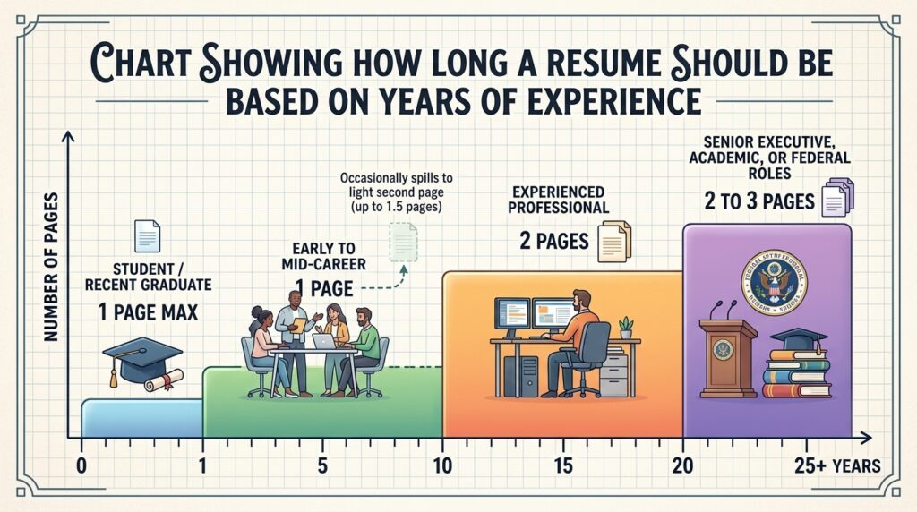
This is one of the most argued-about questions in job searching, and the honest answer has shifted in the last couple of years.
The old rule was strict: one page, no exceptions. That’s no longer accurate for everyone. According to Indeed’s career advice team, a one-page resume still makes sense for students, recent graduates, and professionals with up to about ten years of experience, since hiring managers only spend a few seconds on an initial scan and want the most relevant material front and center. Beyond that experience level, one to two pages is considered standard, and three pages is reasonable only for people with 25-plus years in a single field or in professions like academia and medicine where a longer history is expected.
A large-scale hiring simulation by ResumeGo, which had recruiters review thousands of resumes, found that recruiters actually preferred two-page resumes over one-pagers by a wide margin, even for entry-level roles, and spent close to twice as long reading them. That doesn’t mean padding your resume to hit two pages. It means don’t panic if trimming your real, relevant accomplishments down to a single page starts to feel like you’re cutting muscle instead of fat.
So how many pages should a resume be, practically speaking? Use this as a general guide:
| Career Stage | Typical Length |
|---|---|
| Student or recent graduate | One page |
| Early to mid-career (1–10 years) | One page, occasionally spilling to a light second page |
| Experienced professional (10+ years) | Two pages |
| Senior executive, academic, or federal roles | Two to three pages |
The rule that never changes: every line has to earn its place. A padded two-pager loses to a tight one-pager every time.
How Far Back Should a Resume Go
Trimming length usually starts with trimming history, and that raises a related question: how far back should a resume go?
Most career experts land on the same range. Indeed’s guidance on work history points to roughly the past 10 to 15 years as the sweet spot for most job seekers, though the exact number depends on the relevance of each role, what the job posting is asking for, and how much space you have left after covering your strongest, most recent experience.
A few situational exceptions are worth knowing:
- If you’re changing industries, an older job that’s directly relevant to your new target field is usually worth keeping, even if it falls outside the 10 to 15-year window.
- If a specific skill from early in your career is still a requirement in the job posting, it can stay.
- If you have employment gaps, going back further can sometimes provide useful context, though a brief explanation in your summary often works better than stretching the work history section.
For roles in fast-moving fields like software or digital marketing, lean toward the shorter end of that range. Skills from 15 years ago in those industries are often genuinely outdated, and including them can make a resume look dated rather than experienced. For steadier fields like healthcare, education, or government, the longer end is more acceptable.
One quiet benefit of trimming older roles: it sidesteps the kind of age-related assumptions that can creep into early resume screening, without you needing to say anything about it directly.
Write Content That Actually Grabs Attention
Format and length get you a fair reading. Content is what actually convinces someone to call you.
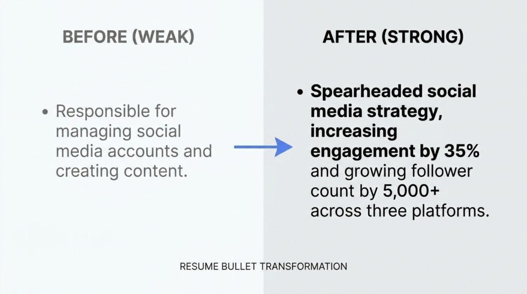
The single biggest shift most people need to make is moving from duties to results. A duty describes what you were supposed to do. A result describes what happened because you did it.
Compare these two lines:
- Duty: “Responsible for managing the social media accounts.”
- Result: “Grew Instagram engagement by 42% in six months by shifting posting cadence and content mix.”
The second version tells a recruiter something specific, measurable, and memorable. It also naturally includes keywords an ATS is scanning for.
A few practical rules for writing bullet points that hold up:
- Start with a strong verb. Words like “managed” and “responsible for” are so overused they barely register anymore. Indeed’s list of resume action verbs groups stronger alternatives by the type of impact you’re describing, whether that’s leadership, problem-solving, or revenue growth.
- Quantify wherever you honestly can. Percentages, dollar amounts, headcounts, and timeframes all make a claim easier to believe and easier to remember. If you genuinely can’t attach a number, describe the scope instead (“across a 12-person team” or “for a client base of 40+ accounts”).
- Keep each bullet to one or two lines. A bullet that wraps to a third line usually has a weaker verb buried in extra words.
- Tailor the language to the job posting. If the posting says “cross-functional collaboration,” and that’s genuinely what you did, use that exact phrase somewhere. It helps both a human reader and an automated system recognize the match instantly.
A resume summary at the top (two to three sentences, not a paragraph) should do the same thing: state your role, your years of relevant experience, and one or two things you’re genuinely known for, in plain language rather than buzzwords like “results-driven synergy expert.”
How to Make a Resume Stand Out Visually
Once the content is solid, design is what makes a reader actually want to keep looking. This is also where people most often overcorrect, either going too plain to be memorable or too decorative to be readable.
Here’s how to make a resume stand out visually without sabotaging it:
Use one accent color, at most. A single muted tone (deep navy, charcoal, a dark forest green) used only for your name, section headers, or a thin divider line adds polish without looking like a flyer. According to Figma’s resume design guidance, color should guide the reader’s eye, not compete with your actual content, and bright or busy colors tend to distract more than they help.
Build clear visual hierarchy. Your name should be the biggest text on the page. Section headers should be noticeably bigger or bolder than body text. Job titles should stand out slightly more than the bullet points beneath them. If everything on the page is the same size and weight, nothing stands out, including the parts that matter most.
Leave real white space. Cramming margins down to squeeze in one more bullet almost always backfires. A resume that looks calm and organized reads as more competent, even before a single word is read.
Use standard, readable fonts. Fonts like Calibri, Georgia, Garamond, or Arial remain the safest choices. They’re professional, easy to scan, and render consistently across devices and printers.
Save the infographic-style resume for the right audience. Skill bars, icon grids, and timeline graphics can look genuinely impressive for creative and design roles, especially when shared directly with a hiring manager or at a networking event. But they’re risky for anything processed by automated screening software, since visual elements like that often confuse a parser entirely.
The practical move many job seekers use: keep a clean, ATS-safe version for online applications, and a slightly more designed version for situations where a human is definitely the first reader, like an in-person interview leave-behind or a direct email to a hiring manager.
Getting Past the ATS Without Losing the Human Touch
Roughly three out of four resumes never reach a human reviewer because they’re filtered out or misread by an applicant tracking system first. That’s not a reason to panic, but it is a reason to format carefully.
A few non-negotiables for ATS compatibility:
- Stick to a single-column layout. Multi-column and table-based layouts can scramble the reading order when the system extracts text.
- Keep contact information in the body of the document, not in a header or footer, since many parsers skip those regions entirely.
- Use standard section headings like “Experience,” “Education,” and “Skills” rather than creative alternatives like “My Journey” or “Where I’ve Been.”
- Avoid text boxes, icons, and skill-rating graphics for anything you need the system to actually read and categorize.
- Save the file as a text-based PDF or .docx, and double-check that the text is selectable rather than a scanned image.
The good news is that none of this conflicts with the visual advice above. A single accent color, clean typography, and generous white space are all completely compatible with ATS parsing. The features that actually cause problems (columns, tables, graphics standing in for text, and unusual fonts) are different from the features that make a resume look polished.
Common Resume Mistakes That Quietly Hurt Your Chances
A few mistakes show up constantly, and they’re rarely fatal on their own, but they add up:
- Objective statements instead of summaries. “Seeking a challenging position where I can grow” tells a recruiter nothing about what you offer. Replace it with a short summary focused on your value, not your wishes.
- Listing responsibilities instead of outcomes, covered above, remains the single most common issue.
- Unexplained employment gaps left completely blank rather than briefly addressed in a summary or cover letter.
- Inconsistent formatting, like mixing date formats or bullet styles between sections, which reads as careless even when the content is strong.
- A resume that hasn’t been tailored to the specific posting, using the exact same generic document for every application.
- Typos and grammar slips. Obvious, but still one of the fastest ways to get an otherwise strong resume set aside.
None of these require a dramatic rewrite. They just need a careful second pass with fresh eyes, ideally after stepping away from the document for a day.
Expert Tips for Making Your Resume Genuinely Memorable
A few additional habits separate resumes that get remembered from ones that simply pass review:
- Lead your work experience section with your strongest, most relevant role, even if it’s not your most recent job, when the posting calls for it. Relevance beats recency in the reader’s mind.
- Match tense carefully. Present tense for your current role’s ongoing duties, past tense for everything else. Mixed tenses within the same bullet list read as rushed.
- Keep a master resume with every job, bullet, and metric you’ve ever written, then trim from that master document for each specific application rather than starting from scratch every time.
- Read it out loud before sending it. Awkward phrasing is much easier to hear than to see.
- Ask someone outside your field to skim it for 10 seconds and tell you what they remember. If they can’t summarize what you do, the summary section needs work.
Traditional vs. Visually Designed Resumes
| Traditional (ATS-safe) | Visually Designed | |
|---|---|---|
| Best for | Online applications, large companies, ATS-heavy industries | Creative fields, networking, direct submissions to a hiring manager |
| Pros | Reliable parsing, universally accepted, low risk | Memorable, shows design sensibility, differentiates in creative fields |
| Cons | Can feel generic if content is weak | Risk of ATS misreads, can look unprofessional in conservative industries |
| Good rule of thumb | Use as your default, especially for corporate or large-company applications | Use as a secondary version, only when you know a human is reading it first |
Frequently Asked Questions
What is the single biggest factor in making a resume stand out?
Specific, quantified results beat everything else. A resume with three genuinely measurable accomplishments will outperform a resume with perfect formatting and vague duty descriptions almost every time.
How long should a resume be for someone with 10+ years of experience?
Two pages is standard and increasingly preferred by recruiters for experienced professionals, according to hiring research from ResumeGo and others. The key is filling that second page with substance, not padding.
How far back should a resume go if I’m changing careers?
Focus mainly on transferable skills and keep the timeline tight, generally under 10 years, unless an earlier role directly supports the new direction you’re taking. A tailored, focused resume beats a long, unfocused history when you’re pivoting fields.
Is a colorful or graphic-heavy resume ever a good idea?
It depends entirely on the audience. For creative roles or a resume handed directly to a person, a tasteful design with one accent color can help. For applications going through an ATS at a larger company, keep it simple and text-based to avoid parsing errors.
Should I use the same resume for every job application?
No. Even small adjustments, like matching language from the job posting or reordering bullet points to lead with the most relevant experience, meaningfully improve how both ATS systems and human reviewers respond to your resume.
Conclusion
A resume that stands out isn’t the one with the boldest design or the most creative section titles. It’s the one that respects the reader’s time: clear structure, a length that matches your actual experience, work history trimmed to what’s relevant, and bullet points built around real, specific outcomes instead of duties.
Start with one section this week, most likely your work experience bullets, and rewrite them using a strong verb and a real number wherever you can. Small, honest changes like that tend to move the needle more than a full redesign ever does.